Marketing works best when it’s led by evidence.
In other words, a series of marketing experiments that progressively build upon one another through iterative testing.
This scientific approach to marketing works because it improves with every success or failure and plays into the strengths of marketing; An abundance of data, a clear goal, and a disproportionate amount of ideas to resources.
One of the toughest parts of implementing a marketing experimentation program is getting the process right. Many teams flit from one shiny A/B test to another, with little accountability or long-term strategy.
In this post, we’ll focus on two essential parts of marketing experimentation; Keeping a healthy backlog of ideas and experiments to test, as well as how to prioritise and track the outcomes once complete.
What are we looking at in this article?
The focus of this article is to suggest a range of marketing experiment and test ideas that will improve the performance of your website and campaigns. You should be able to take these ideas, apply them to your marketing strategies and work your way to better results.
More importantly, though, I hope these ideas provide enough examples for you to go away and find your own experiments, too.
So we’re going to start by explaining why marketing experiments are important and look at how you can run experiments successfully. Then, we’ll get into the experiment and test ideas that put these concepts into actionable examples that you can try for yourself.
As you’ll see from the experiment and test ideas later, some of these focus on very specific elements, such as landing page navigation, while others are broader concepts, like optimising pricing pages, that you’ll need to play around with more for yourself.
Regardless, each idea we cover in this article will look at specific concepts and insights that you can learn from and apply to your experiments.
Why are marketing experiments important?
Marketing experiments generally have one of two aims: to prove an existing theory or try something new entirely. In other words, they provide a means of knowing which marketing strategies work (or don’t) and a measurable approach to trying out new ideas – both of which are incredibly important.
In today’s data-driven age, marketers don’t have to put their faith in concepts and theories. We can prove the value of marketing campaigns, design choices, growth strategies and key business decisions.
As Google puts it, in a guide entitled Proving Marketing Impact (PDF), “one of the most serious challenges in marketing is identifying the true impact of a given marketing spend change.”
“The ripple effect is that marketers must function as scientists, conducting experiments when it comes to allocating budgets—whether by adapting the media mix, trying out different forms of creative, or exploring new marketing channels altogether. By measuring the full value of digital media investments through controlled marketing experiments, we can prove what is effective and what is not.”
Proving Marketing Impact: 3 Keys to Doing It Right, Think with Google
Without a refined experiment and testing system in place, you’re always shooting in the dark with your marketing actions. If you can’t prove the effectiveness of your campaigns, then you can’t know they’re profitable and business growth is going to suffer.
Essentially, you’re gambling with your marketing investment and the odds are stacked against you.
On the other hand, a data-driven model of testing and experimentation puts you in control of your marketing spend. It allows you to prove the ROI of marketing actions, optimise strategies to improve performance and make intelligent marketing decisions.
In practical terms, this allows you to:
- Prove the effectiveness of marketing campaigns
- Stop wasting money on ineffective strategies
- Test new design ideas
- Optimise campaigns and pages to maximise performance
- Try new marketing strategies
- Learn from previous experiments
- Make smarter business decisions
- Identify & stop expensive mistakes
- Innovate new ideas
A good example of this would be our journey with web form optimisation, which not only led us to 700+% higher conversion rates but also led us to innovate a multi-step form concept that nobody else was using at the time.
By innovating this idea (and proving that it worked), we reaped the benefits of the most effective web forms around while everyone else was stuck with lower conversion rates. And this is the thing about marketing innovation: by getting there first, you capitalise on the benefits while everyone else is playing catch-up.
Marketing experimentation is the only path toward true innovation and climbing your way to the top of your industry.
The secrets of a successful marketing experiment
In this article for HubSpot, Kayla Carmicheal runs through the five key steps you should follow for any successful marketing experiment:
- Make a hypothesis: Whether you’re proving an existing theory or going into an experiment hoping to prove that a new strategy is effective, the first step is always to define a specific and measurable hypothesis.
- Collect research: This should include audience research, reaffirming (possibly even modifying) your hypothesis and identifying challenges you’ll face throughout your experiment – e.g.: variables to consider, data attribution issues, etc.
- Define your measurement metrics: With your research complete, it’s time to confirm and define the measurement metrics that will prove your outcome and make sure you have the necessary tools to collect that data.
- Run your experiment: By now, you should have everything in place to run your experiment until it reaches statistical significance and your hypothesis is either proven right or wrong.
- Analyse the results: With your experiment complete, the final stage is to analyse the results and extract meaningful insights from your tests.
That’s a pretty good assessment of the process you should follow and you can find more details about each step in Kayla Carmicheal’s article – note: I’ve paraphrased each step above with my own explanation.
This process is applicable to every marketing experiment and test you could think of but it doesn’t guarantee success. To ensure your marketing experiments deliver valuable insights that result in better marketing and business decisions, there are a few key principles you need to master:
- Choosing the right experiments/tests: This starts with prioritising hypotheses and opportunities with the greatest potential benefit.
- Achieving reliable results: The key to this is mitigating variables that could skew results and running experiments long enough to achieve statistical significance.
- Learn from your results: Not only should you learn valuable lessons from individual experiments but also be building up a history of experience and insights from your ongoing, collective testing strategy.
As I explain in our Landing Page Optimisation: 101 Tips, Strategies & Examples article, the art of deciding what to test and experiment is understanding what truly impacts user behaviour.
“One of the worst A/B testing mistakes you can make is testing every minute detail (button colours, font styles, single words). Stick to testing meaningful variations like two different landing pages or one with multi-step forms and one without. These are factors that genuinely impact the consumer experience and whether people do business with you.”
Running marketing experiments require time and a certain amount of financial investment. So, as with all marketing strategies, you need to make sure that your tests generate a positive ROI.
Start by testing the strategies and elements on your page that should deliver the strongest positive outcome, use your research to reinforce your decisions and apply what you learn to future experiments.
If you’re short of ideas, don’t worry. We’ve got you covered through the remainder of this article.
Website test & experiment ideas
#1: Optimise loading times
It still amazes me that the average loading time of websites and landing pages remain as slow as they are in 2020. It’s not like the impact of page speed upon conversions and just about every user metric that matters is a secret – it’s been documented time and again.
Yet, according to research from Unbounce in 2019, only 3% of marketers listed improving page speed as one of their top priorities.
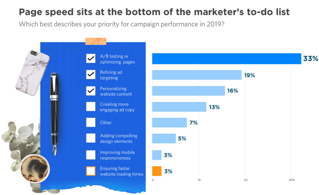
Unbelievably, page speed sat at the bottom of the priority list for marketers in the report while A/B testing or optimising pages came out on top. You have to wonder, what on Earth are marketers optimising if they’re not interested in making their pages faster.
Let’s go back to the key principle we talked about earlier: start with the factors that will have the greatest positive impact.
Page speed is clearly one of these so it earns the first place in our list. If you’re not sure how to approach page speed optimisation, you can find out how we improved our loading times by 70.39% with roughly 40 minutes’ worth of work.
Optimising page speed should be one of the most profitable experiments you run, too. There are plenty of free tools available for measuring loading times and pinpointing specific issues – such as GTmetrix and Google’s PageSpeed Insights tool.

Here’s a quick summary of the steps we took in the article linked above:
- Use a content delivery network (CDN)
- Use WP Engine for hosting WordPress sites
- Use a web caching plugin/service
- Add Expires headers
- Use a fast theme for WordPress or other CMS platforms
- Compress your images
- Clean up your database
- Compress your website with Gzip
- Fix your broken links
- Reduce the number of redirects
- Minify your CSS & JS files
- Replace PHP with static HTML where possible
- Link to stylesheets – don’t use @import
- Turn off pingbacks and trackbacks
- Enable Keep-Alive
- Specify image dimensions
- Specify a character set in HTTP headers
- Put CSS at the top and JS at the bottom
- Disable hotlinking of images
- Switch off all plugins you don’t use
- Minimise round trip times (RTTs)
- Use CSS Sprites
You can find more details about each of these steps in our page speed optimisation article. Collectively, these make a significant impact on loading times and, in turn, all of your marketing KPIs should benefit.
#2: Prioritise hero sections
The hero section is the main feature of every page (and email) that matters. This is the first view users see when they click through to your website, landing page or open up one of your emails and this is the space where your primary message makes its first impression.
In other words, this is one of the most important features of any page with a conversion goal.
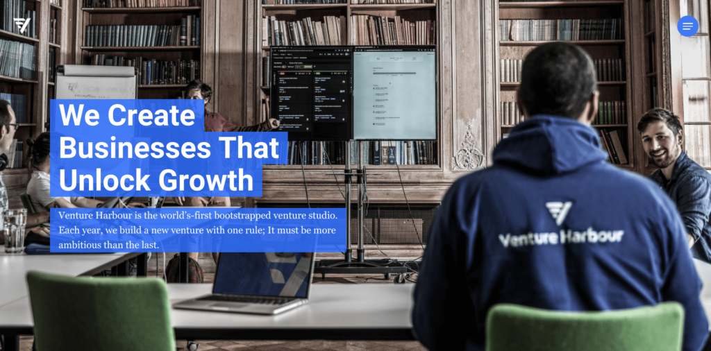
Here at Venture Harbour, we’re constantly testing and experimenting with hero section designs to increase conversion rates, engagement and other crucial KPIs. If there’s one theme that’s been present throughout the years, it’s that simple design and clear messaging are key.
We’ve covered this before in our 3 Homepage Design Tweaks That Increased Our Conversion Rates By 500% article. Here’s a snippet that’s particularly relevant:
“As soon as we lifted the CTA from our hero section and replaced it with a more compelling value proposition, we saw email sign-ups from our homepage increase from 11% to 17% (a 55% increase). That’s pretty impressive when all we really did was remove something designed to convert and rethink our message.”
We’ve consistently found that hero sections without CTAs perform better than those with them – provided our message delivers enough of a value proposition to encourage users to scroll beyond the fold.
This may come as a surprise but multiple tests over the years have confirmed this for us, which is a perfect example of learning from previous tests and applying insights to future experiments.
#3: Remove navigation from landing pages
CTAs in hero sections aren’t the only common design convention that you can prove wrong through testing. In fact, you’ll find some of the most prevalent design patterns are surprisingly damaging for website performance once your testing process is up and running.
Another good example is the use of navigation on landing pages. If you stick to the Goody Two-Shoes guide to UX design, every page should have accessible navigation so that users can move to other parts of your website.
In the real world, though, we’ve got marketing objectives to think about and the last thing you want someone to do on your landing page is click through to another part of your site – away from your CTAs.
Over time, an increasing number of businesses have found that removing the header navigation from landing pages is the way to go.
There are genuine UX benefits for the end user, too. By removing the option of navigation, you increase the clarity of your landing page and improve user focus on your key message while reducing the risk of distractions and decision fatigue – all of which is good for your conversion goals and the short attention span of your typical visitor.
#4: Optimise your sales funnel
Optimising your sales funnel is one of the biggest tasks you can take on in marketing experimentation and conversion optimisation. There are no shortcuts to doing this (none that are worth taking, anyway) and this is something you’ll have to continue doing for the foreseeable future.
For an in-depth look at funnel optimisation, we’ve got two guides that you can read through and save for reference:
- Funnel Optimisation 101: 5 Steps to Fixing a Leaky Marketing Funnel
- Marketing Funnel Strategies: 5 Steps to Increasing Sales in 2020
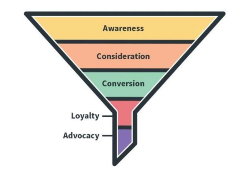
Your sales funnel is designed to capture leads at every stage of the consumer journey and act as a framework for nurturing prospects along the buying process – from first-time visitor to paying customer.
The aim of optimising your sales funnel is to increase the percentage of leads that go on to make the initial purchase and the percentage of existing customers who go on to make further purchases.
One of your key objectives is to identify where leads are dropping out of your sales funnel and put strategies in place to keep these prospects moving along the buying process. This is where our guide to fixing a leaky marketing funnel will come in handy.
Content & messaging experiment ideas
#5: Test different messages
When it comes to convincing users to take profitable action, it’s your content and web copy that has the biggest influence. Ultimately, it’s your marketing messages that decide whether you convert users into leads or customers.
So the majority of your experiments and testing should be aimed at pinpointing the right message for campaigns, ads, pages and emails.
Focus on the key selling points and benefits of your offer, as well as the pain points your target audiences experience (and the solutions you provide). Be specific. Don’t try and squeeze every point into one message. Test different, highly-focused messages that hone in on specific selling points and run with the variation that performs most effectively.
If you can only deliver one message to every user, you need to find the message that’s most effective in the highest percentage of scenarios.
You can also test personalisation features to deliver different messages to users, based on their individual interests. For example, Unbounce offers a great feature called Dynamic Text Replacement, which matches the headline of your landing page to the search terms a user types into Google prior to clicking through.
This allows you to create and test multiple messages for different buyer personas and deliver them with accuracy. Instead of showing one message to all, you can pinpoint the unique pain points of different user types and deliver a more compelling offer.
#6: Experiment with cognitive biases
The secret of effective marketing messages is understanding the psychology of consumers. Even the biggest, baddest CEO is a human being flawed with cognitive biases that affect their decision-making capabilities.
The most successful marketing and advertising campaigns use these biases to create incentive, play with emotions and change the perception of potential buyers.

For an in-depth look at how you can use cognitive biases to create killer marketing messages, take a look at our 9 Cognitive Biases That Influence Buyer Decisions article where we explore the following:
- Confirmation bias: Where people seek, interpret and remember information in a way that confirms their existing ideas.
- Loss aversion: Which describes how we fear loss considerably more than we value gaining something of the same worth – e.g.: we’re more frustrated by losing £10 than we are happy to gain £10.
- Anchoring bias: Where people place more significance on the first piece of information they receive.
- The bandwagon effect: Which explains why people queue up for days to buy an iPhone, think they’re getting good deals on Black Friday and social media trends even exist.
- The mere exposure effect: The reason people are more likely to buy from brands they know well.
- The endowment effect: Explains why people place inflated value on items they own – or believe they own.
- Sunk cost bias: Where people continue to do something because they’ve already invested time, effort or money into it and fear this investment will be lost – even if they’re better off calling it quits now.
- The halo effect: How our first impressions influence the way we interpret further information.
- The serial position effect: The reason people interpret the first and last pieces of information on a list as the most important and remember them more clearly.
You can click on the bold link text of each cognitive bias listed above and it will take you to an article looking at how you can use each of them to create more effective marketing messages.
#7: Capture leads from content
Marketers and brands spend an immeasurable time creating content but how much of it actually generates leads? Think of all those blog posts just sitting there on your website and the time/money it took to produce them – are they paying their way?
If the answer is no, then you’ve got a content marketing ROI problem because everything you publish should contribute to your key marketing objectives: generating leads, sales and profit.

One of the most popular ways to generate leads from web content is to use exit-intent pop-ups and they’ve got their merits. In fact, we take a look at the pros and cons of using them in our Do Exit-Intent Popups Actually Increase Conversions? article.
You can also use live chat widgets and chatbots to prompt user action or request permission to send users notifications – two other strategies with their own benefits and drawbacks.
After testing out various solutions, our current approach is to add dynamic CTAs throughout our blog posts, promoting our most recent ventures.
The key to making this strategy work is to dynamically insert our CTAs in every blog post and continue to update our old content so that it continues to generate traffic, get CTAs in front of eyes and maintain a return on our content investment.
#8: Experiment with content types
As the internet and consumer habits evolve, different types of content assume new roles. Just about every content marketing trends article for the past five years has been talking about the rise of video content and we’ve seen this with the transformation of Instagram from an image-only network to one dominated by video clips.
In the past few years, podcasts have been one of the biggest growth opportunities for content marketers, journalists, celebrities and anyone with a voice.
Video game streaming is now a multibillion dollar industry where people pay to watch strangers play anything from the latest Fifa to retro console games.
Meanwhile, the infographics craze is over and some of the worst content trends like clickbait and listicles are dying a slow death.
Some of these trends are here to stay but it’s very difficult for new publishers to enter the podcast race or new gamers build a huge following on Twitch. You have to react quickly to content trends and build your audience before they’re soaked up by everyone else – just take a look at how hard it is for YouTubers starting out now.
Experiment with content types, find out what works with your target audiences and make your mark before opportunities are saturated by your rivals.
CRO test & experiment ideas
#9: Test your CTAs
We’ve written plenty about testing and optimising calls to action (CTAs) on the Venture Harbour blog. Here’s a selection of some articles that will help you run the best tests and maximise results:
- 19 Compelling Call to Action Examples You Can Steal For Yourself
- Call to Action Best Practices: 15 Tips to Write Irresistible CTAs
- CTA Psychology: 11 Principles That Make Users Click
That should give you plenty of guidance on how to create effective CTAs, optimise them to improve results and an understanding of the psychology behind irresistible CTAs.

As mentioned earlier, the most important principle is to remember that the message in your CTA has the greatest influence upon users. If your CTA copy is compelling, you stand the best chance of convincing users to take action.
There are plenty of design concepts that are important, too, of course:
- Placement
- Contrast
- Text size and weights
- Colour (again, mostly for contrast
Those are the fundamental design concepts you should focus on while refining the message in your CTA to make it as convincing as possible. Try not to get lost in testing button colours and font styles because they don’t have a great influence.
As always, it comes down to testing the details that have maximum impact.
In terms of design, it’s mainly about bold, full-screen CTAs with plenty of contrast that grabs attention and makes your message jump out of the page. Then, it’s all about the message itself and how successfully it compels users to take action.
One final thing to keep in mind is that the content before your CTAs is crucially important too (higher up the page and possibly on previous pages, too). This is the content that primes users for the message in your CTAs and warms them up for taking action – the CTA itself should give them the final push.
#10: Test multi-step forms
After almost a decade of marketing experiments and testing, one of our biggest breakthroughs to date has been the discovery of multi-step forms. You find out how we’ve managed to increase conversions by up to +743% over the course of several.
If we had simply followed the usual form design best practices, we never would have stumbled across the multi-step format. Instead, we would have simply tried to make our forms as short as possible.
However, we tested each and every best practice we knew (or thought we did) and consistently found that shorter forms were being outperformed by longer, more optimised alternatives – and it turned out we weren’t alone.
Generally speaking, longer forms convert more users, as long as you’re able to increase incentive sufficiently enough to justify the length. However, we were still finding conversion rates were lower than we wanted so we started pinpointing the real UX issues of completing forms:
- Typing fatigue
- User error
- Mobile optimisation
- Irrelevant fields
- Completion time
- Complexity
We perceive longer forms as being a UX issue because traditional forms are a pain to complete. It can take minutes for users to fill out a few fields successfully due to the amount of typing required and the workload only increases on mobile where selecting fields and typing is even more frustrating.
It’s only natural that, when users see a long form, they want to run for the hills.
So we decided to remove this perception of workload by only showing the first question in a multi-step format. Now, the psychological barrier preventing users from starting the form process disappears.

Next, we decided to solve the typing problem by switching from text inputs to selectable image buttons wherever possible. Not only does this remove typing fatigue and speed up completion times, it also allows us to guide users through predefined paths and segment leads as they complete our forms.
Taking this concept one step further, we began to use a rule-based technology called conditional logic that filters out form questions based on user inputs so they only see questions relevant to the information they’ve already provided.
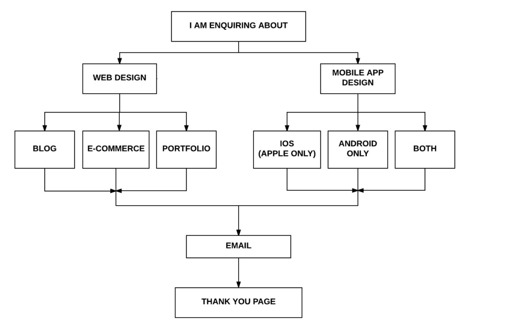
For example, if they tell us that they’re a web design agency, they only see questions relevant to web design projects. This shortens the form experience, reduces fatigue and increases the relevance of every form experience.
You can find out more about the science behind our high-converting multi-step form here.
#11: Simplify onboarding
Web forms play a key role in the onboarding process of every customer and optimising to simplify the sign-up process is a high-impact experiment worth embarking on.
Expanding beyond this concept, you should consider running a series of experiments and tests looking to simplify the entire onboarding process with the aim of reducing the number of leads that slip away during these final hurdles.
You’ve done all the hard work and it sucks to lose them at this point.

Not long ago, we published an article looking at 10 CRO Case Studies You Can Replicate to Increase Conversions and one of the case studies listed provides a perfect example of simplifying the onboarding process.
By using conversion optimisation platform Hotjar, DashThis turned 50% more free trial users into paying customers by identifying onboarding issues and simplifying the process for users.
You can read their case study here.
After using Hotjar for 10 months, the company increased onboarding completion by 50%, increased customer satisfaction by 140% and created new features based on customer feedback to improve its product – not a bad set of results, by any means.
“After having analysed where users encountered roadblocks during the onboarding process, DashThis’ UX team discovered that users simply didn’t know where to click in order to add integrations. Buttons were not displayed in bold enough colours and on some smaller screen resolutions, they were completely hidden at the bottom of the page… To fix these problems, the team modified the layout of the list, added a search bar, and incorporated pop-ups, videos, and different types of content to guide the user step-by-step. The buttons were also modified to be bigger and bolder, and to accommodate those with a smaller screen resolution, buttons were added higher in the page.”
Once again, we see a business running a broad marketing experiment to identify and address specific issues at one of the most important stages of the consumer journey.
This is an experiment that promises high returns on your testing investment and makes a genuine impact upon the customer experience.
#12: Test on human beings
Sometimes, there’s no substitute for testing on real-life human beings but we’re not talking about clinical trials or anything scary like that – just some good, old-fashioned user testing.
The kind of user testing Evernote ran to increase user retention by 15% across all devices (PDF).

Using a platform called UserTesting, Evernote connected with real-world users. While the company had run its own user testing programs in the past, it found them too time and cost-inefficient – a common problem for companies trying to run marketing experiments and CRO campaigns.
Thankfully, there are plenty of platforms like UserTesting available these days that make it easier for companies to test their websites and software products on real-world users.
“In addition to hearing the study participants as they narrate through their actions and decisions, Evernote product managers and designers are able to watch where the testers’ hands are physically tapping, swiping, and even resting. This was especially helpful on Android since multiple devices run on the platform. Because the device type had an impact on the experience, the team needed to be able to identify and fix ergonomics issues before new products were released to the public.”
By identifying and addressing these issues, Evernote increased user retention by 15%, which is the basis of the company’s entire business model of lead generation and upselling through prolonged engagement.
Lead generation experiment & test ideas
#13: Test automated webinars
Earlier, we talked about testing different content formats and this is something we take seriously at Venture Harbour. Over the years, we’ve heard time and again that B2B marketers prefer high-quality webinars over all other content formats and this is something our own testing supports.

The problem with webinar marketing is that it’s incredibly time consuming and it can be very expensive. Manually organising and recording events on a periodic basis requires a lot of resources, which doesn’t really fit with our company ethos of efficiency and automated strategies.
So we decided to experiment with methods of automating our own webinar strategy to tap into the effectiveness of this content format without excessive manual workload.
It was a bumpy process in the beginning, as we’d never automated a webinar strategy before and we didn’t have any real data to work with. However, we started running tests from day one and, within a year, we achieved an attendance rate of 75.62% – more than double the industry average of 46%.
The best part of this strategy is that it’s fully automated so, once you’ve got it up and running, it does all of the hard work for you.
#14: Find a way to offer free value
This strategy predates digital marketing and it’s so common that it borders on cliche but it remains one of the most effective tactics. The key is finding a way to offer perceived value that’s relatively low-cost to your brand but acts as a gateway to something of much higher value.

My favourite example of this is software companies creating free tools and using them to reel in potential customers. Ahrefs does this with its free Backlink Checker that allows anyone to type in a domain or URL and receive a backlink report.
The report in itself is genuinely useful for analysing a single domain or URL but you quickly realise it’s worth looking at the paid version of Ahrefs to get full access to its data and run multiple reports.
The free tool shows you what the platform is capable of and then leaves you craving the full features. Suddenly, that monthly price tag doesn’t seem so unreasonable and signing up for a free trial is only a few clicks away.

We see a similar approach from Crazy Egg, which offers a free heatmap to reel in the leads. Again, you can type in your website URL for a free report. However, the company takes a slightly more aggressive approach than Ahrefs and asks users to create a free account before receiving their report.

We’ve used the same strategy ourselves at Venture Harbour with free tools, such as Marketing Automation Insider, which marketers and business owners can use to find the best marketing software for their needs.
More recently, we’ve published a marketing ROI calculator that you can use and embed on your website.
#15: Test new ad networks
For years, the paid advertising landscape has been dominated by Google and Facebook but things are slowly changing. The rise of social advertising helped initiate change but growth has stalled in that area.
TikTok is writing a lot of headlines as the latest social trend and potential future advertising giant but we’ve seen flash-pan networks crash and burn countless times before.
We’re seeing more robust developments in the retail advertising space where Google is fighting it out with the likes of Amazon and eBay – two giant names without a long history in paid advertising.
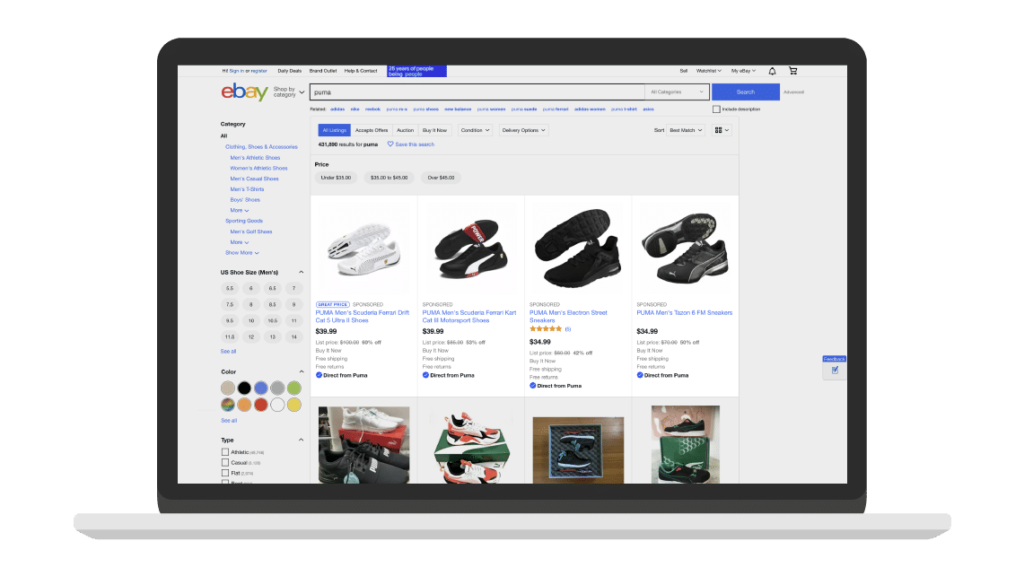
Of course, Amazon and eBay are appealing to retailers and e-commerce entrepreneurs but the platforms are pioneering concepts for industries beyond the limits of online retail.
For example, B2B marketers should pay attention to the new advertising network available on eBay, which allows you to target eBay sellers directly – from major retail brands to solopreneurs selling on the platform.
Select your targeting options and you can reach eBay sellers to promote products and services that will help them grow their business – anything from website builders and accounting software to insurance and delivery services.
With competition increasing in the paid advertising space, marketers need to keep up with developments and be ready to test new ad networks as they emerge.
#16: Experiment with personalisation
Personalisation has been one of the biggest trends in marketing for half a decade or so but it doesn’t come easily. Delivering personalised experiences can be especially tricky in the age of GDPR and increased awareness about data privacy but plenty of brands are making it work.
If you’re struggling with data regulations, you should take a look at our 10 GDPR-Friendly Ways to Personalise Your Sales Funnel article for some ideas.

One of the brands we look at in that article is Stitch Fix, which has created an entirely personalised experience across the customer journey. The great thing about this approach is that the experience itself justifies the use of user data and customers understand that the more data they provide, the better their experience becomes.
Studies have shown that users are willing to exchange data for the right incentive (it comes back to perceived value). The challenge is designing GDPR-compliant consent in a way that doesn’t cripple your conversion rates.
Here’s an article that might help:
Lead nurturing & customer retention experiment ideas
#17: Optimise your pricing pages
Going back to the principle of optimising elements that have the greatest impact, your pricing pages certainly fit into this category. This is the page that’s tasked with convincing users that your product is worth the asking price and alleviating any remaining purchase anxiety.
So, of course, making it clear which features users get in return for their money is crucial and it often helps to offer some kind of free plan or trial to get them on board. Money-back guarantees and other financial reassurances can also help them take the plunge, especially if you create a sense of them having nothing to lose.

On a more psychological level, one of the most common tricks you’ll see on pricing pages is the use of anchoring – one of the cognitive biases we discussed earlier. By placing the more expensive plans to the left or top of the screen, users instinctively use this as a gauge for the following prices, which all seem very reasonable in comparison.
Lead with the $0 free plan and everything that follows seems expensive.
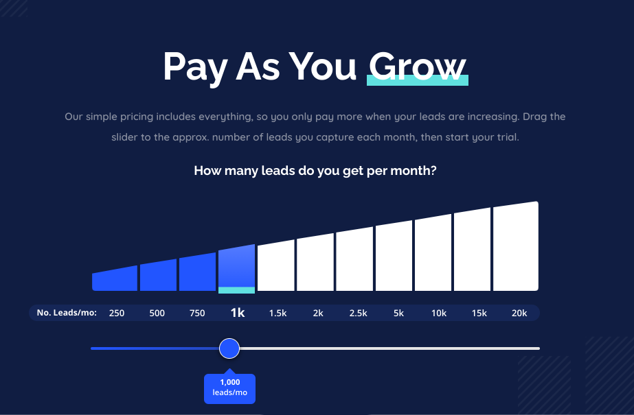
On the Leadformly pricing page, we’re currently testing an interactive pricing page where users select how many leads they generate on a monthly basis to determine the price.
Our approach is to demonstrate how much potential customers are paying for each individual lead to demonstrate the fact that Leadformly more than pays for itself.
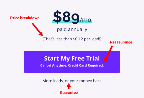
We also combine some classic reassurances and guarantees with a free trial to reduce purchase anxiety and create that sense of having nothing to lose, as mentioned above.
#18: Increase customisability / personalised experiences
We talked about personalisation in the previous section and one of the most effective strategies when it comes to customer retention is encouraging customisation.
This is particularly true for software products and account-based services where individualism is an asset. My favourite example of this is Spotify, which encourages you to create playlists of your favourite songs while its AI algorithms suggest new types of music you might enjoy, based on your listening habits.

By the time you’ve created a few playlists, you’re locked into the platform because you feel like you’re going to lose the time it took to create them (sunk cost bias) and those recommendations just keep on getting better.
The same principle can apply to any software product – all you need to do is build some kind of database that individual users don’t want to lose. It could be analytics reports, performance data, precious memories or anything of perceived value.
This can work for account-based retailers, too, whether you’re selling online or offline. Personalised offers, product recommendations, loyalty rewards and anything you can do to individualise the customer journey is an effective retention strategy.
#19: Test customer retention campaigns
Speaking of which, another high-impact priority for your marketing experiments is always going to be customer retention campaigns. The experiment is to find what works for your customers and keeps them coming back for more.

Email marketing is generally the easiest strategy to automate and this is the perfect platform for a low-input, high-output retention strategy.
#20: Speed up customer service
Customer service is another key component of retention. You have to keep customers happy if you want them to come back for more, even if the initial experience isn’t quite what they expected.
Studies show that customers are generally understanding reasonable issues if they’re dealt with in a timely manner.
Speed matters when it comes to dealing with complaints and this is one situation where automated emails can be frustrating. Chatbots and live chat widgets are perfect for providing an instant response to basic customer problems, buying you essential time to deal with tickets that need handling by human support members.
By automating instant responses, the frustration of one-way email exchanges disappears and you can use bots as an interface for prioritising cases that need the most attention.
#21: Automate re-engagement email campaigns
A common problem you’ll experience with customer retention is that a certain percentage simply stop engaging with your brand. Maybe they no longer use your software product or they’re not visiting your website as often as they used to, even if they haven’t cancelled their subscription or account.
Technically, you’ve still got this customer on board but they’re inactive and in danger of churning at some point.

This is where re-engagement campaigns are crucial as a strategy for reigniting the flame with your precious customers. You can automate these campaigns, too, so that they trigger after a certain period of inactivity, such as the Grammarly email above, which is sent to users who haven’t used its free app recently.
You don’t want to be too pushy with re-engagement campaigns but this is the magic of testing: you can establish the perfect time frames for sending out re-engagement emails to give your customers a gentle nudge without annoying them enough to unsubscribe from your email list.
Test & learn your way to success
The key theme throughout this article has been choosing experiments that are likely to yield high-impact results. If there’s one takeaway from everything we’ve looked at, make sure it’s this concept of high-impact testing.
Hopefully, the examples we’ve covered give you plenty of ideas and help you develop a sense of where the greatest opportunities are.
Just remember that marketing experimentation is an ongoing process and you should learn from the results, even if you don’t get the expected outcome. Invest some time in getting the best insights from your results and truly understanding what they mean so you can apply these findings to future marketing and business decisions.
