Designing GDPR compliant forms is one of the biggest challenges marketers have faced since 2018. Aside from the regulations being frustratingly vague, they seem to go against every form design best practice in the UX designer’s handbook.
Thankfully, we realised a long time ago that best practices aren’t all they’re cracked up to be and we’ve been innovating our own solutions to user problems – including the challenge of designing GDPR compliant forms that still hit conversion targets.
Follow the steps in this guide and you won’t be worried about GDPR killing your conversion rates – in fact, you’ll probably find your forms are performing better than ever.
A quick disclaimer: One of the biggest complaints against GDPR is that the guidelines are too vague. Everything you read in this article is our professional interpretation, not guidance or legal advice.
Step #1: Know your form goals
The first thing you need to know about creating GDPR compliant forms is that your requirements are going to vary from one form to another. It all comes down to what data you’re collecting and what you plan to do with it.
For starters, GDPR only applies to personal information that can be used to identify a person and this certainly includes email addresses, which must be the most common pieces of data requested from users.
So, in most cases where you ask users for an email address, GDPR consent guidelines are going to apply to your form – but even this isn’t clear-cut
Let’s imagine a simple contact form, for example. People are making the choice to get in touch with you and this means they expect you to use their email address to reply to their message.
In this case, GDPR consent guidelines don’t apply.
However, as soon as you set up an email marketing strategy that uses this address to contact users in the future, you trigger both GDPR compliance guidelines and the Privacy and Electronic Communications Regulations (PECR) – yikes!
This leaves you with two options: get consent on the contact form itself or request it in your email response and bin their contact details if they don’t opt-in.
This gives you an idea of how complex GDPR can be, considering we’re only talking about a simple contact form at this point. The good news (kind of) is that most forms you design are going to require GDPR compliant consent and data handling for EU residents.
Step #2: Increase incentive and trust
No matter how well you design your GDPR-compliant forms, there’s going to be added friction. The idea that friction is always bad for conversions is the biggest misconception about conversion rate optimisation but there are two legitimate concerns about designing forms for GDPR:
- Requesting consent emphasises the fact you’re going to use people’s data, which they might not have even thought about previously.
- GDPR’s consent guidelines can add a lot of extra steps if you’re collecting a lot of data.
We’ll look at how to reduce friction when designing your consent request shortly but there’s something else you’ll want to do first. When fiction is inevitable, you can counteract it by increasing two things: incentive and trust.
Studies show people are happy to hand over data to brands they trust so start by improving the wider design of your site and content messages to make people feel more confident about getting personal with your brand.

The next thing you want to increase is incentive. The more reason you give people to complete your forms, the less significant friction is going to be for them. Look at every page containing a web form on your site and identify ways to increase incentive, create more compelling CTAs and make it harder for people to resist your offer.
Build incentive and trust around your web forms and added friction doesn’t need to have a negative impact on your conversion rates.
Step #3: Get consent
Once you know you need to get consent for your form, you have the challenge of designing a consent system that makes you GDPR compliant without causing too much damage to your conversion rates.
Your first task is to make sure you’re compliant; this is your priority. So let’s start by looking at what your requirements are:
- Consent needs to be freely given.
- Consent needs to be specific, per purpose.
- Consent needs to be informed.
- Consent needs to be an unambiguous indication.
- Consent is an act: it needs to be given by a statement or by a clear act.
- Consent needs to be distinguishable from other matters.
- The request for consent needs to be in clear and plain language, intelligible and easily accessible
If you’re thinking that list doesn’t clear much up, you’re right. Here’s a more practical translation:
- Consent options should be unchecked by default.
- You should tell users precisely how you’re going to use their data.
- You should explain separately each way you plan to use their data.
- You should allow users to opt in/out of each way you plan to use their data.
- You need to explain clearly how you plan to use their data.
- It needs to be obvious that users are opted out by default.
- It needs to be clear when users have opted in and the required action should be obvious.
- Opting in should be easily distinguishable from other actions.
- Users shouldn’t be prevented from taking the desired action because they choose not to opt in.
- You need to state how long you intend to use their data for.
Beyond the initial consent process, you’re also required to inform users of any changes you make to how you handle their data in the future. There should also be an easy way for users to opt out at any point in the future. Moreover, they should have the ability to request you delete all of their personal data at any time of their choice (and you’re obliged to do so).
As you can see, that’s quite an extensive list of requirements – especially if you’re collecting a lot of data and using it in multiple ways. So how can you design a consent process that doesn’t get int he way of your data ambitions?
Create multistep forms
We’ve had great success with using multi-step designs to simplify complex forms and maximise conversions. Instead of slapping users with a page full of form fields, break your design into multiple sections for them to work through.
We use Leadformly to create multi-step forms using conditional logic, which asks questions based on the answers users have already given. This means users only see the fields they really need to fill out, making your forms appear shorter than they are.
Make consent options visual
Engagement is important when you’re trying to minimise the negative impact of friction so forget the usual HTML tickboxes. Create a visual consent process that shows you’re a top brand (trust) and makes it easier for users to provide consent.
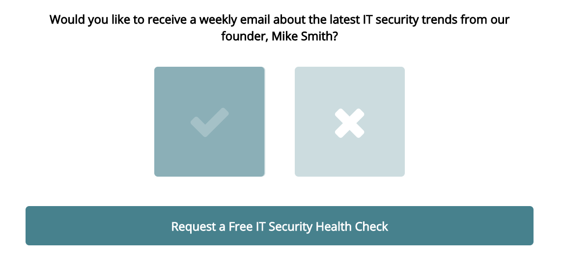
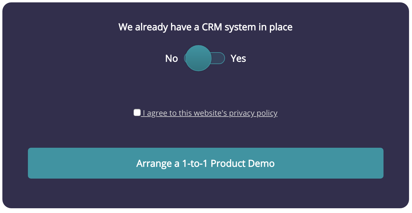
Leadformly gives us three visual options for getting consent.

First, we have image selectors and we’ve found this to be particularly effective across desktop and mobile devices. If you only want to ask one question, this is a great approach to take.

If you want to give users multiple options to opt in/out of, Leadformly’s toggle selectors are the way to go. Again, these work really well across desktop and touchscreen devices while giving you the flexibility to request consent to multiple data uses.

Finally, you’ve got the more traditional checkbox, which can no longer be ticked by default. This feature has been removed in Leadformly as opting users in by default violates GDPR regulations.
Use progress bars

As we’ve mentioned before, progress bars make it difficult for users to quit your once they’ve completed more than half of it. This is due to something known as loss aversion where people feel like they’ve wasted their time if they don’t carry on and reach the finishing line.
Essentially, the more of your forms users complete, the higher their incentive to complete it becomes and you can use this to counter the added friction of requesting consent. Save your consent process for the last stage of your forms and it’s going to be difficult for users to decline by this point.
Step #4: Keep on top of security
Beyond getting consent from users when necessary, your other big GDPR requirement is handling their data in a secure way. You need to make sure you have the right security processes in place to prevent data leakages and a process for handling any data issues.
This includes notifying users of any security threats/breaches and how they’re affected.
This starts with encrypting your forms (as well as your site) and deleting data as soon as it’s no longer needed. You also need to take necessary steps away from your forms to ensure this data is as secure as possible: making sure your databases are protected, choosing a secure web hosting provider, etc.
Step #5: Track performance every step of the way

Being GDPR-compliant is your initial priority but you need to keep track of performance to make sure your forms are still hitting targets. The good thing about GDPR is it’s forcing everyone to take a good, hard look at their form designs and think about ways to design consent requests that don’t hurt conversions.
This new emphasis on form design means a lot of brands will probably experience much better performance after GDPR because they have no choice but to scrutinise their form designs and monitor performance.
Make the most of GDPR
There were a lot of doomsday predictions during the build-up to GDPR but it doesn’t need to have a negative impact on your business. In fact, it could have a very positive impact if you use it as an opportunity to improve the performance of your forms and increase important factors like incentive and trust elsewhere on your site.
Don’t look at GDPR as a conversion killer; look at it as an opportunity to improve the performance of your website and build stronger relationships with your customers.
FAQ
GDPR requires forms to obtain explicit consent before collecting personal data, meaning pre-ticked boxes and assumed consent are illegal. You must also clearly explain how data will be used, provide a privacy notice, and ensure users can easily withdraw consent at any time. The regulation applies to any organisation processing data from EU residents, regardless of where your business is based.
Use a GDPR-compliant form builder like Webflow, Typeform, or Gravity Forms that includes built-in consent checkboxes, privacy policy integration, and data encryption features. These platforms handle much of the technical compliance work automatically, allowing you to create compliant forms through visual interfaces without touching code. Always verify the tool’s data processing agreement (DPA) matches your organisation’s requirements.
Consent checkboxes must be unchecked by default—pre-ticked boxes violate GDPR because they don’t represent active, informed consent. Users must deliberately tick the box themselves to demonstrate they’ve knowingly agreed to your terms. This applies to all consent-related checkboxes, including marketing communications and data processing agreements.
Your form must include a clear privacy notice that explains what data you’re collecting, why you need it, how long you’ll store it, and who has access to it. You should also link to your full privacy policy, identify your organisation as the data controller, and specify the legal basis for processing (e.g., consent, legitimate interest). This information should be visible before users submit the form, not buried in terms and conditions.
Store form data on encrypted servers with restricted access and implement security measures like SSL certificates, firewalls, and regular backups. Only authorised team members should have access to submitted data, and you must delete information when it’s no longer needed (following your retention policy). Consider using form tools that offer GDPR-compliant hosting and automatic data encryption rather than storing submissions in spreadsheets.
Consent requires explicit opt-in from the user, while legitimate interest allows processing if your organisation has a valid reason that outweighs user privacy concerns. For marketing forms, consent is the safest approach because it’s unambiguous and gives users full control. Legitimate interest works better for essential business operations like fraud prevention or customer service, but requires documented justification.
Use privacy-focused analytics tools like Plausible or Fathom that don’t require consent banners and don’t track individual users across sites. If you use Google Analytics, you must anonymise IP addresses and obtain consent before tracking. Monitor form completion rates, drop-off points, and conversion metrics while ensuring your analytics setup respects user privacy and complies with GDPR data minimisation principles.
Yes, Webflow supports GDPR-compliant form creation through its native form builder and integrations with compliant third-party tools. You can add unchecked consent checkboxes, link to privacy policies, and configure form submissions to be stored securely. However, you must still manually add privacy notices and ensure your data processing agreements are in place with Webflow and any connected services.


